Shutterstock
I initially joined Shutterstock as part of the newly-formed Music team, where I helped to launch the new product offering just four months after starting, and reach our MVP KPIs and internationalize within our first year. Following that, I moved to the Search & Discovery team where I led the design effort to reimagine the way users search, browse, and save content, with the goal of maintaining a higher volume of downloads.
The following work represents some of our research and initial concepts around this effort, as well as some future-state ideas to bring Shutterstock back to being an innovator and differentiator in the digital content space it defined.
Filters & Collections
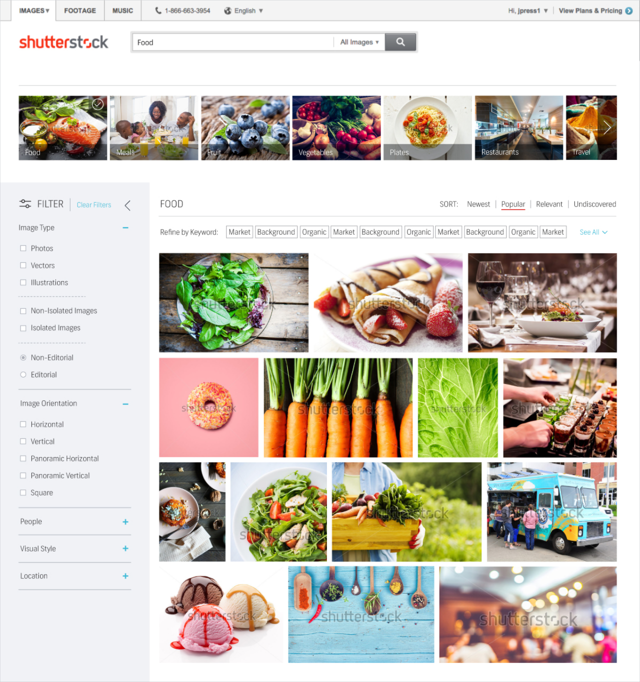
Legacy Filters
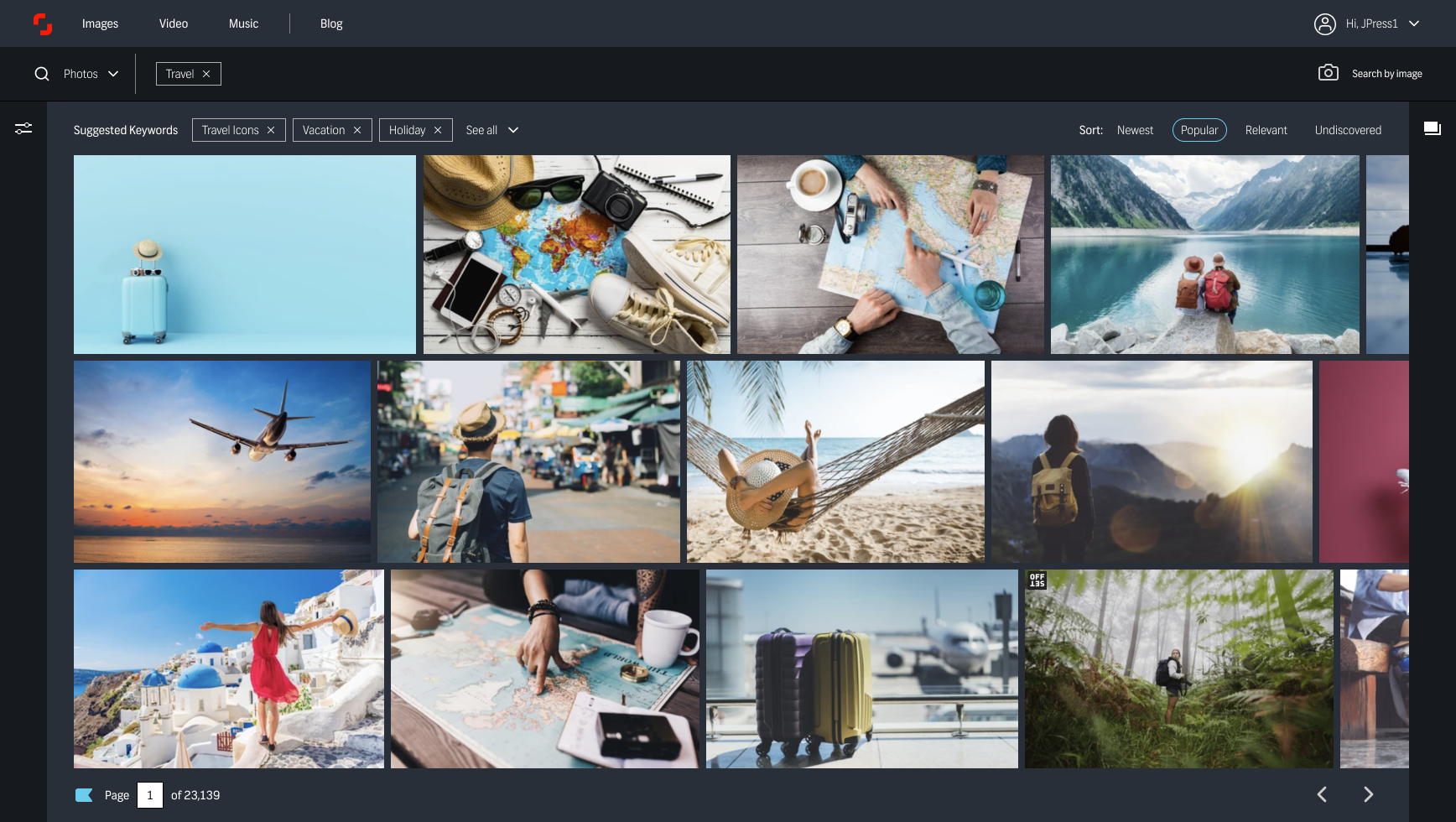
Largely unchanged for several years, filters were accessed through a subtle “Refine Your Search” link to the right of the search bar. Site analytics, customer feedback, and user interviews told us that this was a massively underused feature, and that many loyal, long-time users didn’t even know it existed, despite years of regular use.

Research
Shutterstock was an incredibly successful company and had recently gone public. Not wanting to disrupt such success, the strategy around site, product, and feature updates was to iterate slowly and to test absolutely everything. This resulted in significant tech debt, innovation stagnation, and falling behind our more risk-tolerant competition. I saw filters as an opportunity to challenge this mindset and push for taking bigger swings and greater risk.
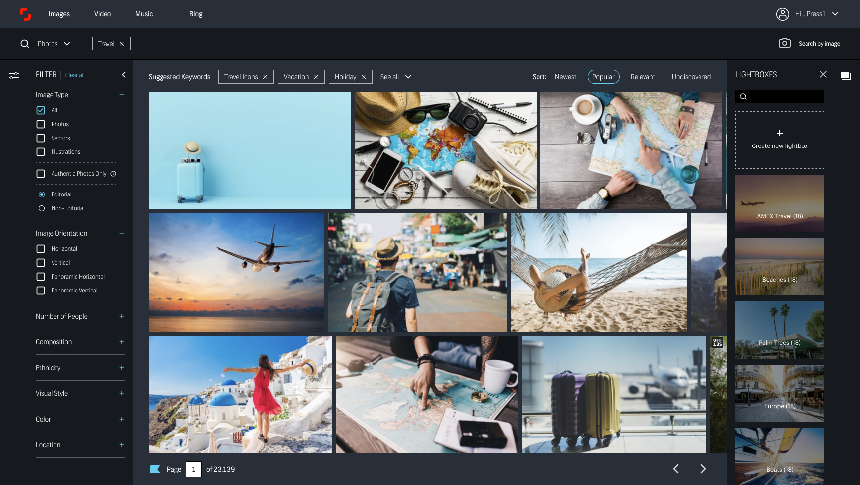
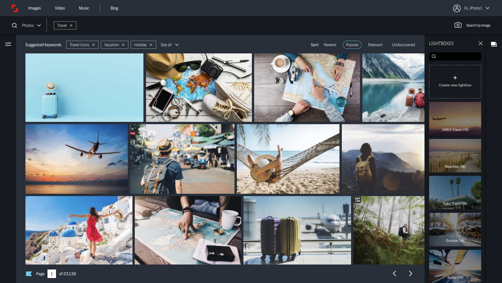
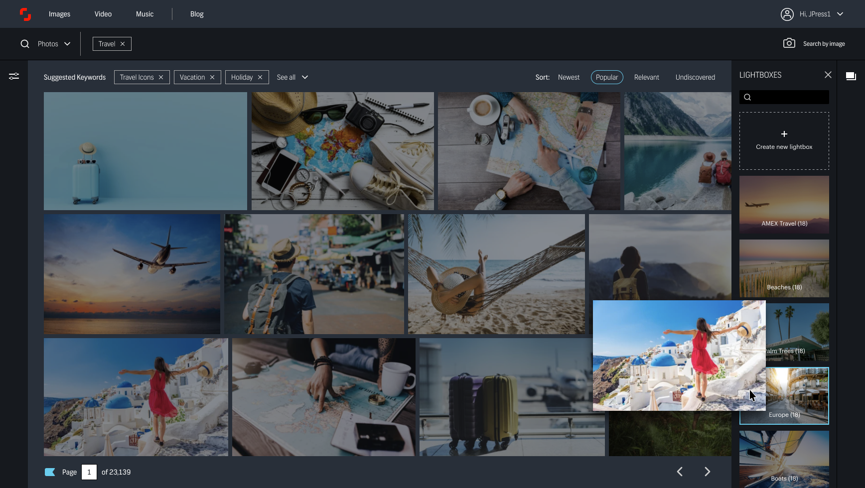
In addition to feedback on filters, we also heard frustration from users around the clunkiness of lightboxes (saving content in organized buckets or projects), and the disproportionate effort to save images from search results into their collections.
I designed three variations of bringing filters and lightboxes into the page and created clickable prototypes to be tested with users during a week of research.
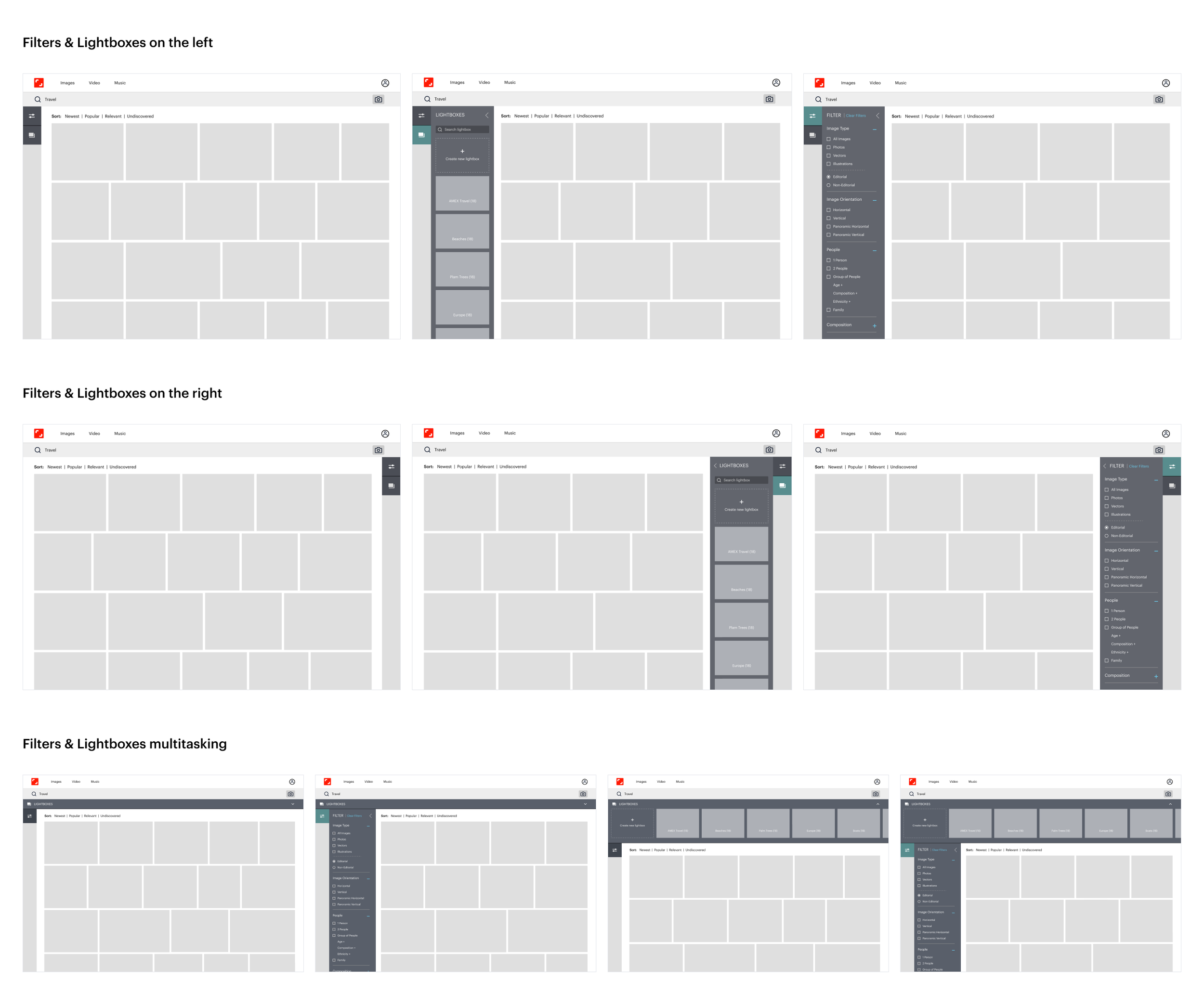
Before prompting our participants to use the prototype, we asked: between these three concepts, which appeared to be the most intuitive and logical workflow? While users initially said they were drawn to the first concept, and liked the idea accessing both features from the same place, once they began to interact with the prototypes, the feedback deviated from their initial assumption: the majority of participants found it most intuitive to refine on the left, analyze the images in the middle, and save images on the right — following the most basic pattern of reading from left to right.
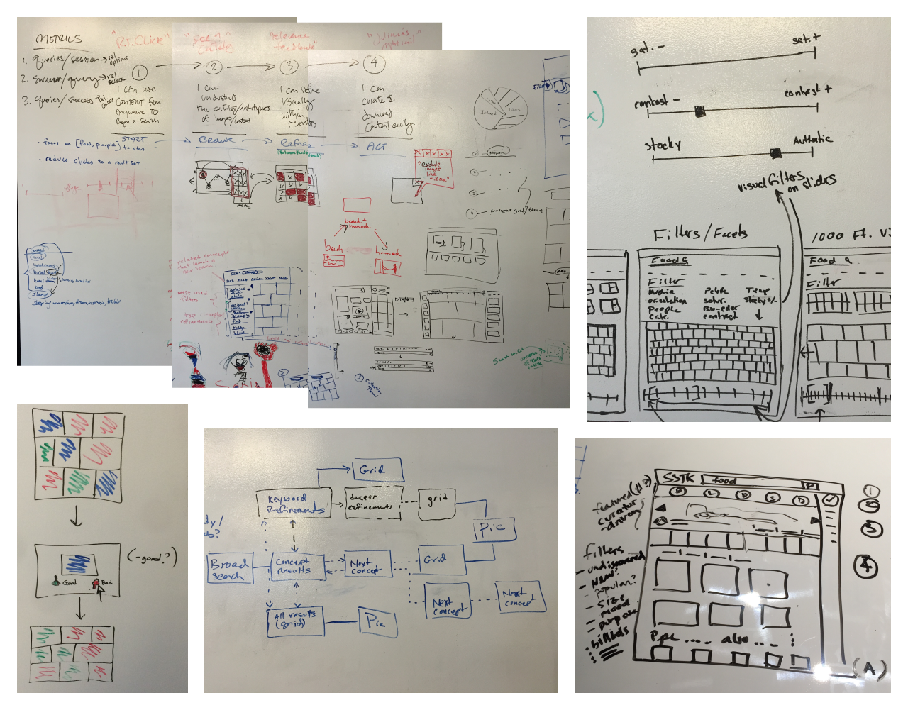
Workshop Sketches
I insisted that the team’s engineers be included in our workshops. With their participation, we quickly discovered that we could do more than just make filters more visible — we could fundamentally change the way people searched for content, helping them to refine and curate their needs in a more efficient, intuitive, and personalized experience.

Visuals
MVP Designs

MVP in Production

Future State
From the many brainstorming sessions with my team, as well as collaboration with other teams, I continued to iterate on designs for Shutterstock’s Enterprise users — power users who had different needs than our core users, and paid for a more expensive subscription plan inclusive of a greater number of downloads, more authentic imagery, and access to an Enterprise-exclusive customer support team.
The concept was a desktop application with a layout and functionality to take greater advantage of the screen size we knew these users had, and a sleek, elevated aesthetic designed to fit in with many of the other tools on their desktops: horizontal scrolling, left-to-right multitasking, dark interface to make the authentic images pop.