SigFig
Digital Wealth — A Configurable Ecosystem
When I joined SigFig as a principal designer, I was asked to take a holistic look at the product ecosystem and identify gaps and opportunities, both in the experience and in the business. I worked collaboratively and cross-functionally to learn perspectives, observations, pain-points, goals, etc.
From here I laid out two primary goals:
• Expand revenue opportunities within existing products (Digital Wealth)
• Develop innovative new products to acquire new customers and retain existing customers (SigFig Path)
This project takes a look at expanding revenue opportunities within our existing products.
Increase Revenue from Existing Products
Overhaul the design system
• Centralized rather than customized
• Modern, flexible, scalable, accessible
Use the design system to create a system of pre-built widgets/modules
Use widgets to create a configurable product ecosystem
Use configurations to create delineated product tiers
Use product tiers to define structured pricing models, and streamline sales pitches

SigFig’s core experience is a white-labeled robo-advisor tool called Digital Wealth. In recent years, the product had become limited, with little room to grow, and had begun to ossify. Robo-investing was also beginning to sputter and the space had become saturated.
I led the design team in establishing Digital Wealth as core to a suite of SigFig products, and as the engine to additional products beyond investing.
I identified a better, more focused angle on banking products and took the team through a process of 1) identifying realistic product opportunities and spaces to explore; 2) concentrating on specific personas that the retail banks had as clients, but for whom investing was unknown and unaffordable. The more extensive offering would be a gateway to a broader set of tools and financial stability for clients, and expand and increase revenue for the business. This can also be seen in SigFig Path.
SigFig’s Users
Clients & customers of banks and financial institutions in North America
Bankers
Financial Advisors & Planners
Customer service & operations agents
Prior State
Siloed approach, no interconnectivity, increasing costs, no synergy

New Architecture
Unified value prop, integrated user experience, off-the-shelf suite of banking products

Design System
My first step was to revamp the design system. The legacy system was visually and functionally outdated, and was an accessibility liability. Having a modern design system that was easily scalable would not only give us a foundation for the future of the platform, it would also allow us to more incrementally introduce and test the system within the existing product suite.
I led the team in a SWOT analysis/audit of the product ecosystem to identify the most critical areas of need, as well as those areas of opportunity, to help shape our approach to designing the new system and set priorities on the product roadmap. Based on the outcomes of the audit, I recommended beginning with foundational system elements, such as color, buttons, type, and text fields.

Because the platform was white-labeled and styled to align with the banks’ brands upon implementation, we wanted to emphasize a more neutral color palette with the banks’ primary brand color serving as an accent, rather than a dominant color across the products.
This would present users with a cleaner and more consistent experience across the SigFig products, limit bugs and broken layouts, and give SigFig more control over the implementation process in general, resulting in faster integrations.

The new color palette gave us and the banks more flexibility with how to represent their brands, with the option to use their brand color(s) for primary and secondary buttons, or go with our out-of-the-box neutrals. The higher the pricing tier a bank chooses, the more customization options they’d have access to.
Legacy Type

New Type

Typography created one of the biggest issues in the legacy system. The internally branded experience used two typefaces, which made swapping in the banks’ type system all the more difficult. As long as the banks were given the option to customize with their type, it would require our design team to custom-design and QA every product and page included in the implementations.
Our ultimate goal was for the banks to use our out-of-the-box typeface. By switching to a modern and more geometric face in Graphik, we could, again, present users with a cleaner and more consistent experience, and one that met the top accessibility standards in the industry. As with other aspects of the implementations, if the banks were opting for the highest pricing tier, they’d be given more flexibility with customization.
To establish the new platform as the future of the product ecosystem, I led the team in creating a configurable system of widgets and templates.
This would support the flexibility to scale the existing experience, and grow product offerings beyond investments. It would also improve development efficiency, and reduce time-to-market and overall cost of implementations and maintenance.


I collaborated with an engineering director to design a framework for these widgets that he could start to build and test with.
On the far left is the grid we defined for the modules; next to that are some of the module variants we created that would offer maximum flexibility for configurations, while still allowing builds to be months faster than in the prior experience.

Widget explorations
The legacy experience didn’t have a true information architecture or navigation structure. The products were rigid and difficult to iterate on, and there were few established UI patterns to follow, with most pages lacking hierarchy and consistency. With this modular strategy, we could construct a simple architecture and assign principles to each level, to give meaning and purpose throughout. It could also bring more structure and stability to SigFig’s sales process: more consistent pricing, higher revenues, and greater opportunity for upsells.
Through this exercise we determined that not every aspect of the experience could be modularized, nor should it. Rather, the modules represented top levels of information — presented consistently with easily identified patterns; as one goes deeper into the experience, the density and tooling increases, requiring component-based builds over modular. This progression in the UI visually signals to users where they are within the experience, a welcome change from the homogeneity of the prior design.
0.0 Homepage / Dashboard
See an overview of your profile, accounts, etc. Take high-level action or drill into any of the content presented on this page. It’s enough to paint a complete picture, but not overwhelming or dense.

1.0 Detail Pages
Dig into details, like those about a specific account or goal. The information is a little more dense, and helps users make informed decisions and take action on the spot.

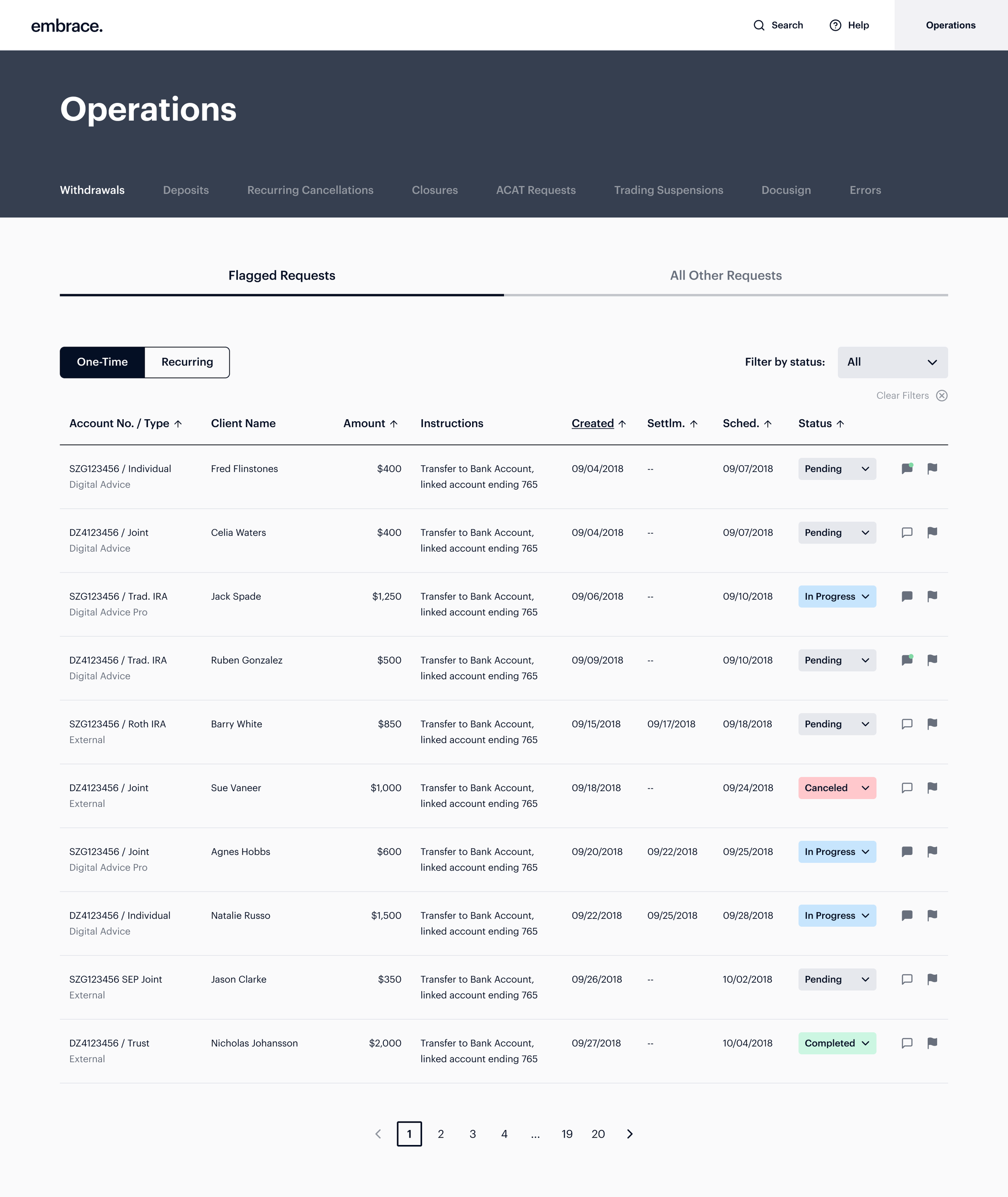
1.2 Tooling
Primarily a space for bankers, advisors, and home office employees. View complete client lists & books of business, transactions and activity. Take action and assign tasks.

-- Immersive Workflows
A flexible space supporting any focused activities or work such as onboarding, creating/editing goals, retaking the Risk Tolerance Questionnaire. It’s a full-screen overlay, more like a modal than a page to navigate to. It can be triggered from anywhere in the experience, so it’s not designated or accessed at a specific level.


0.0 Homepage / Dashboard: Prior State

0.0 Homepage / Dashboard: Redesign


1.0 Detail Pages: Prior State

1.0 Detail Pages: Redesign


1.2 Tooling: Prior State

1.2 Tooling: Redesign

– – Immersive Workflows: Prior State

– – Immersive Workflows: Redesign
